|
MicrostockGroup Sponsors
This section allows you to view all posts made by this member. Note that you can only see posts made in areas you currently have access to.
Messages - trevarthan
1
« on: October 29, 2014, 06:19 »
You probably wore them down. Let us know if it sells.
Three times so far. Shrug. It's not nothing.
2
« on: September 10, 2014, 09:21 »
Well, there you go. The squeaky wheel gets oiled (And noted in the intranet system as being a total pain in everyone's ass): http://www.shutterstock.com/pic.mhtml?id=216088459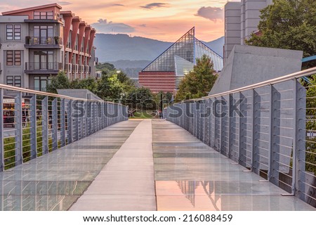 I didn't get an explanation this time. I was just told to resubmit it and given an admin code.
3
« on: September 10, 2014, 09:12 »
I think the problem is somewhere else. Example - you have a lots of photos of a bridge, but who is interested in that? I mean, what did you want to tell with those photos? If you photograph a famous bridge on a nice light it's something different, or if you've seen interesting detail on a bridge, or interesting reflection, etc, etc...
I've seen people who are interested in advertising real estate events in town buy them.
4
« on: September 09, 2014, 08:19 »
Doing highlights and shadows all the way is a trick I first heard from photographer Serge Ramelli. I just found out that it might be ok as a starting point, but it is too extreme for most of my photos. The philosophy is ok, I guess, but that is just the starting point.
Concerning SS - that's the queston of what kind of photos will sale - I had a lots of photos with completely good light, soft shadows, everything ok, even though I got rejections with light problems. Then I've found out it is not really light, but the colors.
For example, the cloudy sky should give the perfect light - but that is not good enough for SS. If the histogram is a bit on the dark side - and there are lack of colors on the photo - not good.
I probably got it from the same guy. I watched a youtube video trying to figure out the best way to pull the shadows up after switching from Lightroom 3.3 to Lightroom 5.5. A bunch of the interface had changed, and some guy offered that technique. It worked well and gave me the results I wanted, so I've been using it ever since. Here's the histogram for that HDR:  I'm no expert, but it doesn't look underexposed to me (usually that means there is a gap on the right). It doesn't look overexposed (usually that means the curves are clipped at the top). And it seems to have a full range of colors.
5
« on: September 08, 2014, 10:39 »
In Lightroom:
- Highlights all the way down
- Shadows all the way up
- Just enough bump on the Whites to bring back the specular highlights.
- Just enough bump on the Blacks to blow some of them (hold the Alt key while sliding to the left until you see just a tad black show up).
- Vibrance +8 (practically nothing)
- Saturation +8 (again - nothing - just a hint)
- "Enable Profile Corrections" and "Remove Chromatic Aberration"
Sorry if this is stupid, I am not very experienced at post-processing after all -- but you really do hold highlights/lift shadows all the way on every single photo? I mean, won't that make you end up with a completely flat, pseudo HDR look? Don't get me wrong, I am all for a little highlight/shadow correction, but all the way on every photo seems excessive.
The other thing I would add my two cents to: I, too, shoot mostly in the "landscape", "architecture", or "travel" categories, and I have learned a long time ago that while that stuff does sell, it doesn't sell as much as other things. That's just how it is.
Shrug. Looks great to me. I'm not great at editing. I try to keep it simple. And yeah, I know the sales are slower. Doesn't really bother me. I enjoy shooting it.
6
« on: September 08, 2014, 03:42 »
Seems like I've move beyond "missing the mark technically" to an issue of business marketability. I welcome that problem. Seems like progress.
7
« on: September 06, 2014, 21:50 »
Hard to be other than totally subjective here, but IMHO the "blue hour" photo creates a mood and since the bridge is the sharpest area of focus, the beautiful museum building seems incidental, whereas in the HDR photo the impossible depth of field is jarring and, despite being identical to the accepted blue hour photo in many respects (the same image processed differently? or a re-take? - either way, it just doesn't work because it seems fake). They can't reject it for "everything being in focus," though ironically that is the major problem, so let's look at the stuff that might have been acceptable if not for the "too perfect as to seem unreal" DOF (IMHO) - the colors seem tweaked and the distinctive building is more prominent.
I really like the blue hour photo - and I'm sure the other one took you ages to stack and tweak - but chalk it up to experience. Personally, I've spent hours "improving" something in Photoshop only to realize I actually ruined a good picture, it happens.
I remember being at PhotoExpo when I first started, listening to an editor from Travel & Leisure explain why she hated some photo where everything in a beautiful hotel room was in perfect focus as was everything outside the window and it was all perfectly exposed.
What makes a good photo? There are rules and there are great photos that break those rules, but ultimately at some point it is subjective, though IMHO the rejected photo breaks rule #1 - a travel photo needs to be real.
Hope that helps.
Eh. Good feedback. Definitely not what I wanted to hear, but good nonetheless. For the record, it's definitely a reshoot. The blue hour photo (I'm guessing you mean the darker of the two) was shot with an 85mm PC-e. The bridge tiles were in perfect focus all the way across (downward lens tilt), but everything else blurs a bit. The architectural guys on a landscape forum I frequent told me to sell the lens after I took that shot because I wasn't using it the way it's supposed to be used. It really bent them out of shape seeing me butcher it that way. That's why I called it "crap". So I thought, I'll do it again with the 85mm 1.4g at sunset and a focus stack. Surely everyone will love that.  It's funny... the colors aren't tweaked at all. I mean, I used exactly the same processing on this photo as I did on the others. I have a super simple formula: In camera, I expose as far to the right as I can so I get the benefit of the complete dynamic range the sensor is capable of. In Lightroom: - Highlights all the way down - Shadows all the way up - Just enough bump on the Whites to bring back the specular highlights. - Just enough bump on the Blacks to blow some of them (hold the Alt key while sliding to the left until you see just a tad black show up). - Vibrance +8 (practically nothing) - Saturation +8 (again - nothing - just a hint) - "Enable Profile Corrections" and "Remove Chromatic Aberration" That's it. That's all the processing I do, and I do exactly that same step by step process for every photo I submit to shutterstock. Other than that, it's as shot. 6 shots, only the focus motor moved in between. So yeah, this is actually how the scene looked. I did a little dance when I successfully completed the stack because there are always people walking across this bridge, and it takes a good minute to complete the walk, so it's super rare to get 10 seconds of clear bridge, much less the 2 minutes necessary for a focus stack set, and much much less the 2 minutes I needed right in the middle of a fading colorful sunset when the lights under the bridge are just starting to brighten. (for some reason, people start flocking across the bridge at sunset - never fails - it's like the colors behind them light a fire in their legs - I don't understand it) I guess I'm getting dinged for doing a good job. I don't know. I think what you're really saying is that maybe this just isn't a stock photo. Maybe it works better as fine art. Maybe I need to always keep it simple for stock. White puffy clouds. No colors. Shame though. I'd prefer to let the market determine if they want it or not, rather than some reviewer.
8
« on: September 06, 2014, 14:16 »
The next image up, the one on Flickr, looks a bit "flat and grey" to me. Needs a bit of a mid range contrast boost IMO.
As already said though, it's all pretty subjective. One man's "giving it a bit more pop" is another's "too much contrast"
Agreed re: second image. That's why I tried the HDR. It worked to fix the contrast. What about the HDR? What could be improved there?
9
« on: September 06, 2014, 13:09 »
........My experience is that once they reject an image, they become dogged and reject any attempts to correct the image for the rejection reason out of hubris. "You don't like our rejection reason? Too bad. No amount of correction on your part will fix it. You're done." I hate that.
not true -- I often get images accepted that were initially rejected for white balance or lighting, especially late afternoon lighting -- as others have mentioned, you're going to have different reviewers, so different rejection reasons are not uncommon. and reviewers often just give 1 or 2 reasons for rejection when they may have other concerns too -- it's how it works.
So what can I do to improve the lighting in this photo?
10
« on: September 06, 2014, 12:06 »
I learned a long time ago not to take rejections personally. . .
I reckon that's good advice. I don't know anything about Shutterstock specifically, but I've never thought that rejections were personal. I generally just move on to the next shots. Life's too short to worry about it!
"Personal" implies emotionally butthurt, I think. I'm not butthurt about this. I just want to know what I did wrong. I don't understand, and I can't play the game if I don't understand the rules.
That's good that you're not taking it personally, but it still strikes me that you're trying to analyse and quantify something which is really just a subjective judgement. It depends on opinion of the reviewer you get. There are no set "rules" as such, just a matter of judgement within certain parameters. Again I will say though that I don't know the ShutterStock system specifically. I'm talking generally.
I agree. I just want to make sure that this is 100% a subjective rejection and not a technical rejection. Subjective rejections shouldn't be tolerated in this highly technical industry, IMO. But that's a different discussion.
11
« on: September 06, 2014, 11:47 »
I learned a long time ago not to take rejections personally. . .
I reckon that's good advice. I don't know anything about Shutterstock specifically, but I've never thought that rejections were personal. I generally just move on to the next shots. Life's too short to worry about it!
"Personal" implies emotionally butthurt, I think. I'm not butthurt about this. I just want to know what I did wrong. I don't understand, and I can't play the game if I don't understand the rules.
12
« on: September 06, 2014, 11:20 »
I wonder if that distinctive building in the BG may be a trademark concern? There are several reviewers at SS and what one may accept another may reject particularly if trademark issues are questionable which may explain why that building got by some inspectors in previous images.
Can't be. There are tons of images of the aquarium. I think it's more likely that the Ice Cream Show's sign in the lower left corner (the "M SHO" is obscured by a railing post) is causing concern, but I don't know. I asked for clarification from shutterstock. We'll see what they say. Incorrect WB is a favorite rejection reason. It seems that some inspectors don't take into consideration the time of day the image was shot or the lighting conditions under which it was shot. I use the Colorchecker Passport when I shoot to make certain I'm getting the proper WB and still get WB rejections, occasionally.
Seems like it's a "we just don't like it" reason then. That's a shame, because their advertisers might like it anyway. I think the white balance is fine here, for the record. It's just a colorful sunset. I don't shoot HDR so I'm not familiar with SS policy with that technique....it does look HDRish to me so perhaps that was a factor in this rejection.
I don't know the policy either, but I tried to submit it first without HDR. Twice. This was the first rejection reason: Poor Lighting--Image has exposure issues, unfavorable lighting conditions, and/or incorrect white balance. Note that there was no mention of trademark or wb. So I brightened the fill (at the expense of the sky), and this was the second rejection reason: Trademark--Image / Metadata potentially infringes on intellectual property rights.
Composition--Image is poorly composed and/or poorly cropped.
Poor Lighting--Image has exposure issues, unfavorable lighting conditions, and/or incorrect white balance. I actually thought I deleted that second image before it hit their reviewers, so I was surprised when it finally got reviewed alongside the HDR. This is it on flickr though:  Ruth Holmberg Pedestrian Bridge at Sunset Ruth Holmberg Pedestrian Bridge at Sunset by Trevarthan, on Flickr As you can see, it's not much different from the HDR. The sky is just a bit more washed out and the concrete and glass tiles don't have quite as much "punch". IMO, the HDR is "better". The HDR was my attempt to ultimately "fix" the exposure issue. It offered the best of both worlds. Properly exposed sky and properly exposed foreground. Sigh. My experience is that once they reject an image, they become dogged and reject any attempts to correct the image for the rejection reason out of hubris. "You don't like our rejection reason? Too bad. No amount of correction on your part will fix it. You're done." I hate that.
13
« on: September 06, 2014, 09:31 »
all three photos are fine, especially the last.
But look at the rejection reasons, that basically say:
not relevant for stock, there could be trademarks, and lighting is strange.
all is true.
They don't say that, really. But that's what I took away from it too. Am I twice as likely to be rejected if there is a colorful sunset in the photo? I was wondering all night if that was the red flag that got me. the point is your are not in a photoclub where you try to impress other photographers.
I resent that a little. I'm just trying to portray the scene at it's best and most beautiful. I think that's what most travel photographers do. Instead you are on a marketplace where you want to make customers pay for your images. So you need to think about the customers needs and that is not interesting light, or interesting compositions.
I saw a photo from istock on facebook a few months ago of this scene. It was clearly a purchased stock image and shutterstock didn't have the same version. The one it had was weak, IMO, so I started shooting it. I'm also wondering if they're rejecting me because I have three different photos of the same scene at this point, ignoring the fact that this one is technically the best. However, none of the photos on shutterstock are at sunset with a colorful sunset, so I thought the time of day would be useful for some advertisers. Was I wrong? If that's the case, I can always reshoot, waiting for a colorless sunset with clouds, like this: 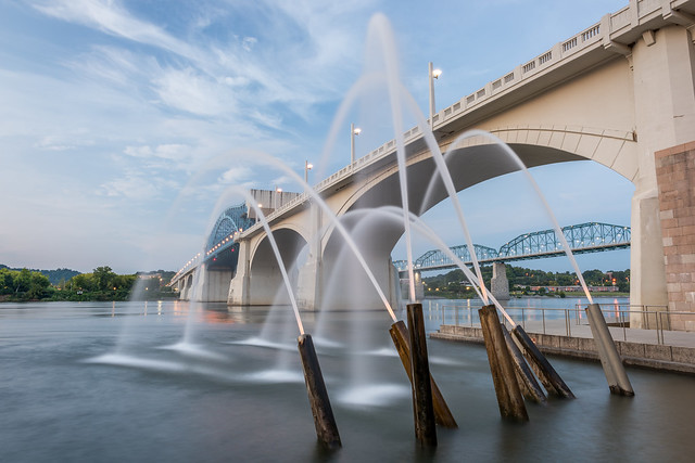 Ross's Landing with Fluffy White Clouds Ross's Landing with Fluffy White Clouds by Trevarthan, on Flickr 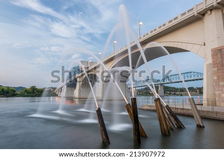 I just need to know if sunset colors are something to avoid. If you put a woman with a shopping bag on the bridge it will be much more stockworthy, but still the bridge and buildings are distracting, unles you aim for a special modernistic urban impression. And are there customers for that?
Not a bad idea at all. It's just a different kind of photo from what I see mostly for travel photos. Usually I'll have to shoot with higher shutter speeds and use f2 instead of f8, or else keep the model extremely still. I'm not opposed. This was just the low hanging fruit. Thanks for the feedback, btw. I appreciate it.
14
« on: September 05, 2014, 16:52 »
For crying out loud. You accept this crap from me: 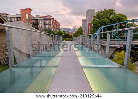 And this even crappier image: 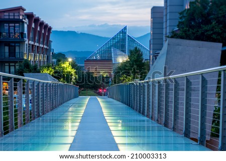 But then I get a clue and take a 6 shot focus stacked, HDR masterpiece like this: 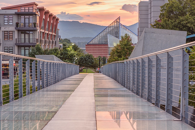 And your door goons reject it for ... Trademark--Image / Metadata potentially infringes on intellectual property rights.
Composition--Image is poorly composed and/or poorly cropped.
Poor Lighting--Image has exposure issues, unfavorable lighting conditions, and/or incorrect white balance. Honestly... I'm starting to wonder why I'm even trying. 
15
« on: August 16, 2014, 17:58 »
Since you have the photo already, why not submit it as editorial (according to SSs ediorial guidelines, which I'm not familiar with).
Excellent idea. I'll do that. Thanks.
16
« on: August 16, 2014, 17:06 »
I agree. Good advice.
17
« on: August 16, 2014, 16:35 »
Update on this... SSTock asked me to clone out the billboards: "Dear Jesse,
Your e-mail is appreciated.
I have checked your image with our Legal Department.
As per their decision, you may consider a resubmission, if you clone out the billboards on the right side of the image. (The Hunter Invitational, and the Enjoy music...)
After retouching those out, please consider a resubmission, and add the following Note To Review:
ATTN REVIEWER: See an Admin about this batch (re:case #01113477)
Please remember: This note does not guarantee approval.
Please feel free to contact us if you have any additional questions.
Best regards,
Mate Toth
Contributor Success
Shutterstock" Unfortunately, after I did so (spending at least an hour in the process) and resubmitted, I received another rejection: Model Release--A complete & accurate Shutterstock approved model and/or property release is required.
We do not accept images of modern architecture or images where the architecture is the main focus. I mean, I already knew the architecture was an issue. I was asking for clarification only. It's highly annoying being asked to do additional work with the implication that compliance will yield acceptance (but not the guarantee), only to be shut down for exactly the same reason. Sigh. This seems to be a pattern with microstock. Ask a hard question, be asked to do more work and resubmit, and get rejected again. It's like a "stupid tax" or something.
18
« on: August 13, 2014, 08:00 »
I'm guessing the problem is the modern building on left. Architects now often copyright there building designs.
How does that work? The customer buys the building, but the architect owns the copyright? That's kind of like my cutting board, but I made that cutting board with my hands. Architects generally are Work-for-hire, aren't they? How come we can photograph other buildings? Wouldn't the contractor own the copyright or something?
19
« on: August 13, 2014, 07:39 »
2 days ago, Shutterstock accepted this photo (and it sold almost immediately, which is nice):  Glass Pedestrian Bridge and Aquarium at Sunset 24mm Glass Pedestrian Bridge and Aquarium at Sunset 24mm by Trevarthan, on Flickr But rejected this photo:  Glass Pedestrian Bridge and Hunter Museum at Sunset Glass Pedestrian Bridge and Hunter Museum at Sunset by Trevarthan, on Flickr With the reason, "We do not accept images of modern architecture or images where the architecture is the main focus." I contacted them immediately for clarification, because both photos contain modern architecture in the same proportion, and the focus in both photos in on the bridge itself. I waited 2 days, but didn't receive a reply, despite their usual 24 hour contact us reply time. Any ideas why they might have rejected that?
20
« on: August 06, 2014, 22:30 »
f16 is dead to me. It's f8 or bust.
f8 sounds pretty possible to be the sweet spot. most lenses stop down 2, 21/2 , 3, for that.
and in my case, with most of my working lenses, i found f8 to be the sweet spot.
congrats on both approval of this image and finding f8.
According to this site and their 3d blur graphs (pretty cool), f5.6 is the sweet spot for the 24mm f3.5 PC-e and the 24mm f1.4g: http://www.slrgear.com/reviews/showproduct.php/product/1176/cat/12http://slrgear.com/reviews/showproduct.php/product/1325I'll have to try f5.6 next time. I'll also make sure I do some research on this in the future before shooting.
21
« on: August 06, 2014, 16:12 »
Shutterstock accepted this one today, graffiti and all:  Latest Iteration Latest Iteration by Trevarthan, on Flickr I don't like the colors as much as the one I posted earlier, but it's definitely a sharper image. Taken at f8, with the bridge girders in sharp focus all the way down the path. I took a little time to learn the math behind my tilt shift lenses, making this cool chart in the process:  Nikon Tilt in Degrees for Distance (web) Nikon Tilt in Degrees for Distance (web) by Trevarthan, on Flickr Then I used a 1 degree tilt on my 24mm PC-e to take the shot. I may retake the photo sometime using focus stacking. We'll see. Glad to have it approved though. Now I can move on to some other scene. I'm hoping this means I'm starting to get a grip on the technical side of things and understand where the "bar" is. f16 is dead to me. It's f8 or bust.
22
« on: August 06, 2014, 12:21 »
SStock do not always take 24 hours. You are in the low season and during this time, I used to get approval within the hour.
The approval time varies dependant on the period .
I didn't intend that statement to mean that shutterstock ALWAYS reviews within 24 hours. I meant that for me, the average was within 24 hours, which is way better than the multi-week istockphoto average review time. Officially, shutterstock aims to review within 10 days: http://submit.shutterstock.com/faq.mhtml#How long does it take for content to be reviewed?
23
« on: August 02, 2014, 17:17 »
I see this was shot at f16 so diffraction probably caused the supposed softness particularly if the rest of your technique was solid. And at ISO 400 with a 30 sec exposure noise would've been a factor as well....did you run it through a noise reduction program, either that in LR or something else?
I don't have any experience with the D810 (yet) but I do know that with my D800 at ISO 400 and a long exposure noise would have been a problem.
Yup. Lots of noise. I was quite surprised. I could have shot ISO 64 if I calculated the exposure length properly and manually shot longer than 30 seconds with my shutter release cable. I didn't have a chart for that on hand though and can't do the math in my head yet. I think the best solution for noise would have been an exposure blended shot, in this case. As for f16... I'm going to try to shoot this scene using tilt at f8. We'll see if I can manage to make that look ok or not.
24
« on: August 02, 2014, 13:25 »
whether they sell or not, and as another member pointed out, I'm missing the mark technically. I can't seem to get my landscapes through the review filters.
which review filters? there are so many sites to the right of Tyler's forum. just because we make money mostly with SStock does not mean you cannot make money with other sites. we have other ppl here who say they make more with the single digit sites .
the competition is stiff for sure with SStock,as with the need to be business only to know what SS sells. but it does not mean other sites will not sell for you.
I don't understand your logic here. If SStock sells best for the majority, it makes sense to learn how to pass their review filters. In particular, I enjoy their turn around time. istock takes weeks to reply sometimes. SStock only takes 24 hours. That's a much better learn -> change -> resubmit cycle.
25
« on: August 02, 2014, 12:57 »
I think what it boils down to is that right now I'm most interested in landscapes, whether they sell or not, and as another member pointed out, I'm missing the mark technically. I can't seem to get my landscapes through the review filters. I'm either going to solve that problem (I'm trying a lot of new things right now), or I'm going to give up and decide to shoot something else.
I haven't given up on the landscapes yet, and I probably won't unless I decide that the only kind of landscape that makes it through the filter is the kind I'm not interested in shooting. I haven't seen that yet. I've just seen me botch a couple of landscapes, technically. I can do better, and will.
Feeding my family isn't an issue right now, thankfully. I'm gainfully employed as a software engineer. From a high level, this is about the pursuit of happiness and (hopefully) retirement. It's about getting paid to do something I enjoy. It's about solving a single problem (because that's what I do best), then using what I learned to solve other problems.
I may find a nice niche market for my landscapes within microstock sites. I may not. I can't know the answer to that question without figuring out how to elevate my work to a level that passes the review filters. So, while I appreciate the feedback to focus on other things and listen to the market, let's keep the discussion technical for now, because that's where I think I need to improve the most.
|
Sponsors
Microstock Poll Results
Sponsors
|


